THE QUESTION
Can the shape of a score distribution make the numbers easier to understand?
What you can explore
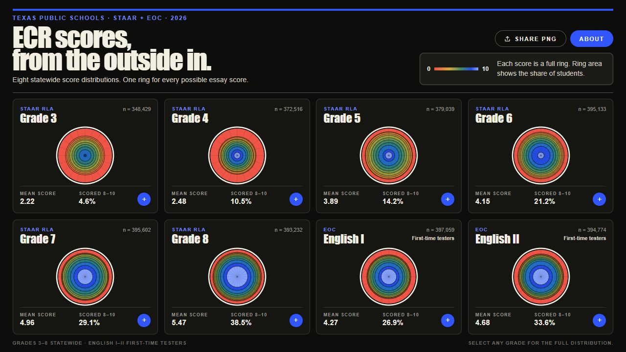
- Explore eight distributions: grades 3–8 and English I / II.
- Inspect score counts, percentages, mean, median, and high-score share.
- Open detailed score tables and export grade views as PNGs.
A deliberate choice
Map the share of students to ring area, not ring width. Score 0 sits at the outside; score 10 sits at the center. Keep the underlying table available for a second way to read the data.
What it is built on
Based on reported student counts in the 2026 Texas Assessment Research Portal ECR rating summaries. English I and English II include first-time testers only.
TRY A DATA PREVIEW / GRADE 3 · 2026
Read the shape.
Select a score to highlight its share of students. The outer ring is score 0; the center is score 10.
Essay component only. Ring area represents student share. Portfolio rendering of data published in ECR Outside In ↗, which cites 2026 Texas Assessment Research Portal summaries.
KEEP IN VIEW
What this can’t tell you
This shows the essay component, not whole-test performance. Different prompts across grades mean the charts cannot establish why grade distributions differ.
This overview describes the public tool reviewed in September 2026. It does not claim measured classroom impact or independent evaluation of the project.